🌟 Survey Insights Simplified: Beautiful McKinsey-Style Visuals! #datastorytelling #excel #chart

19:07
Make Beautiful Excel Charts Like The Economist (file included)
7:51
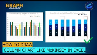
[Chart64]🌟 Dynamic Salary Analysis: Visualize Banking Averages Like a Pro 🚀#datastorytelling #excel
14:57
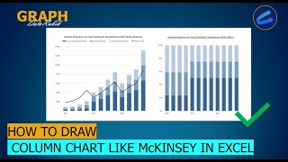
[Chart49]📊 Stunning Stacked Column Charts in McKinsey Style! 🚀 #datastorytelling #excel #chart

11:09
4 Hidden Excel Dashboard Design Tips for Beautiful Reports
9:56
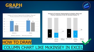
[Chart62] 💹 Understand Category Percentages Clearly with McKinsey-Style Charts 🌍📈 #datastorytelling
8:50
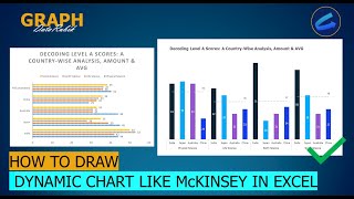
[Chart61]📊 Breaking Down the Numbers: Amounts & Averages in McKinsey Style 📈💡 #datastorytelling
10:48
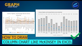
[Chart57]💼 Salary Insights Simplified: Highest, Lowest, and Average in One Chart! #excel

5:23